
Showing posts with label inclusive design. Show all posts
Showing posts with label inclusive design. Show all posts
Old Age Does Not Mean Living in a Design Ghetto
"With populations around the world aging rapidly, we need to re-think how we design for older people. We can keep older people safe, but trapped in gilded cages. Or we can design to keep them active and fully integrated in society. Professor of Design Jeremy Myerson makes a powerful case for the latter."
When everybody plays, we all win
"When technology empowers each of us, it empowers all of us. This Super Bowl, follow the inspirational story of passionate young gamers rising to the top of their game with a little help from their friends, family and the Xbox Adaptive Controller. The story illustrates Microsoft’s commitment to building accessible technology that levels the playing field and creates opportunity for all of us."
This ad was called the highlight of the Super Bowl 53 ("The game didn't quite live up to expectations, but Microsoft's ad for the Xbos Adaptive Controller did.") (c|net).
Thank you, Microsoft!
Meet the Normals
A short film created by the Centre for Excellence in Universal Design shows what taking the bus can mean to a normal family.
Kitchenware for Users with Sight Loss

British product designer Simon Kinneir uses "subtle sensory feedback" to help users with visual impairment.
"If somebody has sight loss, it's not black and white. If someone has hearing loss, we don't have to make huge iterations to our environments products and services, but actually we can give subtle cues and people can work with those."The Leaven jug features a slanted container made of stainless steel, suspended in a tubular metal framework with an angled base. As the jug is filled up its balance changes, causing it to tip forward slightly so a user touching its frame knows when it is nearly full." (via Dezeen)
Self-confidence in the kitchen improves self-sufficiency for people with sight loss. Whether through temperature, sound, or movement, these products amplify active processes in the task at hand."
Simon Kinneir
image via Dezeen
Inclusive Design - Architecture for Everyone

Excerpt: Despite a vast set of rules and regulations concerning architecture for disabled people, the built environment still lacks functionality and accessibility. Architecture is often not suitable for handicapped people, whether the impairments are permanent or temporary. Building regulations focus mainly on wheelchair users as a stereotype disabled person while disregarding other limiting factors to other fringe groups. The variety of impairments being immense and architecture needing to be useable or adaptable to the needs of every person, more suitable guidelines than strict and non-flexible building regulations are necessary. Todayʼs state of the art in accessible design is called Inclusive Design. In contrast to other regulations for disabled people, Inclusive Design doesnʼt give a set of rules, but principles for orientation. The thesis will explain that ID is not a new idea, but is a logical consequence deriving from the history of design for disabled people. Furthermore the application of ID in different European countries will be shown.
::: Download: Inclusive Design - Architecture for Everyone, MA thesis, 2011, 76 pages
- - - - - - - - -
photograph via Robotix
Kitchenware for visually impaired users
"If somebody has sight loss, it's not black and white. If someone has hearing loss, we don't have to make huge iterations to our environments products and services, but actually we can give subtle cues and people can work with those."
Simon Kinneir, British product designer
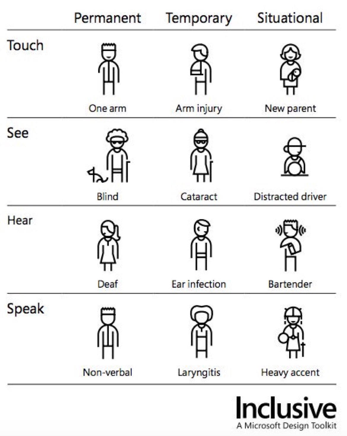
Microsoft's Inclusive Design Toolkit

"There are universal ways human beings experience the world. All people have motivations and build relationships. We all have abilities and limits to those abilities. Everyone experiences exclusion as they interact with our designs. On the other hand, a solution that works well for someone who’s blind might also benefit any person driving a car. Inclusive design works across a spectrum of related abilities, connecting different people in similar circumstances."
::: Inclusive. A Microsoft Design Toolkit: DOWNLOAD
- - - - - - - - -
image via
Inclusive City, Safe City
For photographs of the new intelligent zebra crossing in the Italian city of San Fermo della Battaglia see LINK
The Acceptance Ring

"Designed with support from Marc Newson, each limited ring has been carefully crafted and engraved with an inscription of acceptance. The unique design features an electroplated matte black finish and a signature 2.2mm gap symbolising the current inequality of marriage within Australia. Show your acceptance today."
"This incomplete ring symbolises the gap in marriage equality that we need to close. Until the day comes when two people who love each other can celebrate that love through commitment, will you wear this ring and show your acceptance of marriage equality?"
Via/More Until We All Belong
"Openness and belonging are at the heart of Airbnb — it's at the core of what we do every day … This is an opportunity for people to show their support for marriage equality — not just those within the LGBTQI+ community, but for anyone to make their support for a brother, sister, parent, friend or loved one known." Brian Chesky, Airbnb CEO
More clips:
::: Michelle's story: WATCH/LISTEN
::: Geoff's story: WATCH/LISTEN
::: Sally's story: WATCH/LISTEN
- - - - - - - - - -
Image via Mashable
Michelle Obama says...

"Yes there are the projects that happen downtown – that important building, that important park – but there's also those community centres, those parks and district facilities, the homes, the opportunities that you have to make a neighbourhood beautiful for a family or a child that feels like no one cares."
"When you run out of resources, who's the last to get the resources? The kids outside the circle."
"Cities are a complex, big, messy enterprise. And they're expensive."
"To have a city with millions of people – with dense populations, great architecture, economic development, commercial development – and when you think about what it takes to run a city – the infrastructure, pot-hole repairs, traffic safety, you name it... it is expensive. It takes an investment."
"This project means the world to me and knowing that we have architects that appreciate the whole project and not just what the building looks like – which is important, but it's a building that's sitting in a neighbourhood."
"If we're going to have cities, then we have to invest."
(quotes via Dezeen)
- - - - - - - - - - -
photograph via Business Times
Wheelchair Accessible Garden Kit

The Suitecase is a group of architects and artists that created the TERRAform program for wheelchair accessible gardens.
Read the full article here
- - - - - - - - - -
via Universal Design Style (Photo: TERRAform)
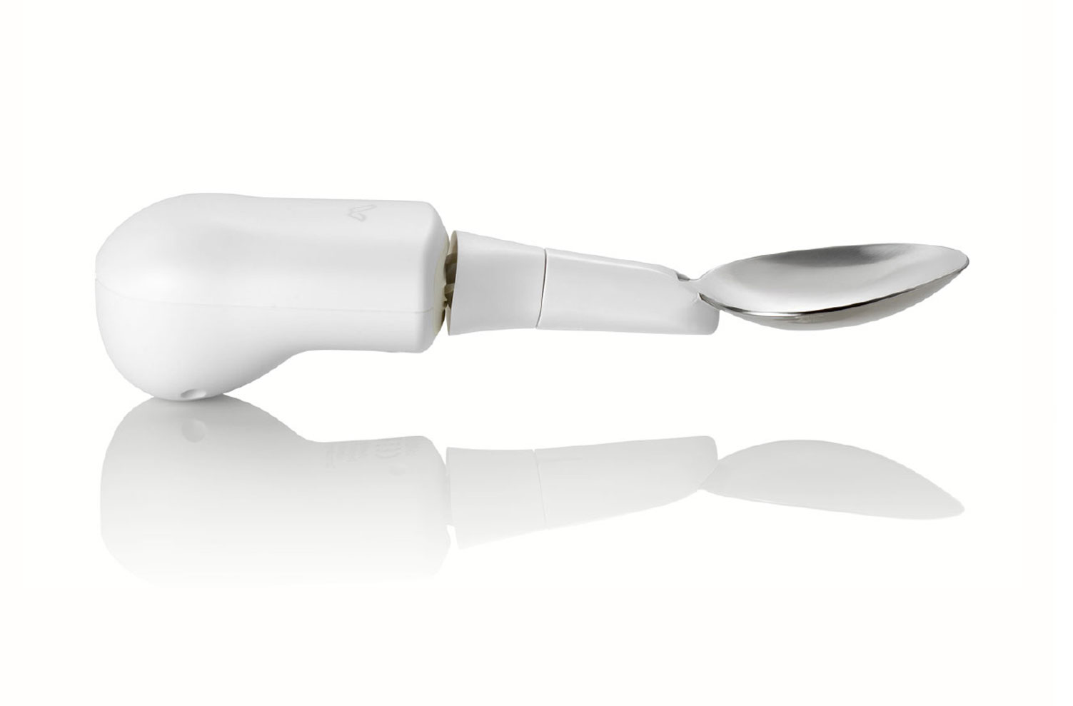
A Smart Spoon Helps Shaky Hands

“I felt a loss of dignity. I felt like everyone was looking at me because I had trouble getting food from my plate or my bowl to my mouth without spilling. I just felt more comfortable to stay at home and eat by myself.” Stephanie Mendel, 78Liftware's spoons are designed for a) people with limited hand and arm mobility and b) for people with hand tremor. Electronics in the handle of the "anti-shake" spoon cancel out shakes by 70%. Those with limited hand or arm mobility (e.g. due to cerebral palsy, spinal cord injury, Huntington's disease, post-stroke deficits) find eating easier as sensors inside the handle constantly track the user's hand positions and adjust them.
Liftware founder Anupam Pathak started Liftware in 2013 to help people with neurological conditions. In 2015, spoon prices were dropped to make them more accessible. San Francisco-based Lift Labs have been bought by Google.
(via Mail Online and San Francisco Chronicle and Cerebral Palsy News Today)
See how it works:
::: Introducing Liftware Level: WATCH
::: Liftware counteracts shaking: WATCH
- - - - - - - - - -
Photograph via Liftware
Accessibility App Simulates Colourblindness


An Android app developed by Bill Anderson this year helps both designers and developers experience colourblind vision in order to apply accessibility to their work (The Costa Rica Star).
"The Colorblind Simulator app for Android is a collection of simulation tools. It includes tools for images, text, Material Design colors, and any single RGB color. Currently, it is the only color blindness simulation toolbox available for Android."::: Colorblind Simulator Pro: LINK
More:
- Coblis - Color Blindness Simulator: LINK
- Ishihara Color Test: LINK
- Color Blind Check (free test app): LINK
- Color Blindness - learn all about it: LINK
- - - - - - - - - -
Images via Google
Lighting, Low Vision & Building Codes

"The assumed lighting restrictions associated with the ANSI/ASHRAE/IES 90.1 energy standard are fundamentally based upon recommended light levels found in the Illuminating Engineering Society’s (IES) Lighting Handbook. These light levels are historically based upon the needs of normally sighted people. The solitary goal of the energy code has been to reduce energy consumption by imposing limits on the amount of power that can be used for lighting per floor area and therefore ignores quality of light, health, safety and hours of use. While mandating greater use of daylight will help reduce daytime energy use, glare and contrast are quality of light issues yet to be addressed.
Quantity and quality of light are the crucial elements for the low vision population. This presentation will review how we account for these while accommodating the restrictions in the energy code as well as other building codes and standards such as the NFPA, IBC and LEED. Recently, the power densities for senior care facilities in the 90.1 regulation standard were increased substantially after a convincing case was made based on scientific research. Although this increase was made for limited space types, this action paves the way for broader changes to the various building codes in an effort to support the low vision population.
It is time that universal design went beyond mobility and addressed sensory loss, including low vision; to truly be “universal” design."
Full article:
::: Dupuy, R., Guarnaccia, G. & Noell-Waggoner, E. (2013). Lighting, Low Vision & Building Codes. DOWNLOAD
- - - - - - - - - -
photograph via Curated
A Wheelchair Designed for Dancers

A "University of South Florida-born power wheelchair" is designed to give its ussers more freedom of movement allowing them to express themselves, to dance. Wheelchairs, so far, have been too rigid for modern dance dance. Merry Lynn Morris's "Rolling Dance Chair, however, is flexible. Morris began working on the fance chair five years ago, the first prototype debuted in 2013.
"Through a wireless connection with the accelerometer and other motion sensors on the user's phone, the chair can sense the person is leaning, and lean with them. The wheels are tucked away to prevent costumes from getting tangled. And like a Segway (which partially served as a design precedent), the chair moves faster the more the user leans." (mental_floss)More: YouTube
- - - - - - - - - -
Photograph via The Journal of Humanities in Rehabilitation
Suffering from poor eyesight or design? Some thoughts on web accessibility.

"Typography may not seem like a crucial design element, but it is. One of the reasons the web has become the default way that we access information is that it makes that information broadly available to everyone. (...)
But if the web is relayed through text that’s difficult to read, it curtails that open access by excluding large swaths of people, such as the elderly, the visually impaired, or those retrieving websites through low-quality screens. (...)
It wasn’t hard to isolate the biggest obstacle to legible text: contrast, the difference between the foreground and background colors on a page. In 2008, the Web Accessibility Initiative, a group that works to produce guidelines for web developers, introduced a widely accepted ratio for creating easy-to-read webpages.
To translate contrast, it uses a numerical model. If the text and background of a website are the same color, the ratio is 1:1. For black text on white background (or vice versa), the ratio is 21:1. The Initiative set 4.5:1 as the minimum ratio for clear type, while recommending a contrast of at least 7:1, to aid readers with impaired vision. The recommendation was designed as a suggested minimum contrast to designate the boundaries of legibility. Still, designers tend to treat it as as a starting point.
For example: Apple’s typography guidelines suggest that developers aim for a 7:1 contrast ratio. But what ratio, you might ask, is the text used to state the guideline? It’s 5.5:
Google’s guidelines suggest an identical preferred ratio of 7:1. But then they recommend 54 percent opacity for display and caption type, a style guideline that translates to a ratio of 4.6:1. (...)
So why are designers resorting to lighter and lighter text? (...)"
via/more Kevin Marks (Backchannel)
- - - - - - - - - -
Image via Pexels
A watch designed for blind people

"We started out thinking about what kind of watch would work for blind users and we struck upon this idea of using ball bearings rotating around a track to indicate the minutes and the hours on the dial.""Designer Hyungsoo Kim was in a lecture hall at Massachusetts Institute of Technology in September 2011 when a neighbouring student asked him the time. "My classmate is visually impaired, and had been for 10 years," explains Kim. The student had a watch that could tell the time, but only by pressing a button that would make it speak out loud. Doing so in a classroom could be disruptive, so instead, says Kim, "I was his wristwatch."
David Zacher
BBC
"Manufacturers of accessible goods for blind people have discovered that producing something functional isn't enough - blind people always ask what it looks like, even though they can't see. In some ways, this suggests that it matters more if you're trying to control what people might think of you.""The watch is named after Bradley Snyder, an ex-naval officer who lost his eyesight in an explosion in Afghanistan in 2011 and who went on to win gold and silver medals at the London 2012 Paralympic Games."
Damon Rose
Dezeen
- - - - - - - - - -
Image via Slice of MIT
Subscribe to:
Posts (Atom)